Without Studio redesigns Sodexo’s billion-dollar US dining offer with One&All, a celebration of collegiate diversity

Independent London agency Without has unveiled a major branding project for Sodexo’s US college dining offer, now called One&All, championing diversity through flexible design and a collegiate spirit.
How do you create a brand that appeals to everyone without becoming generic? That was the central challenge for Without Studio as they partnered with Sodexo to reimagine the food experience across US college campuses.
The result is the bold, flexible brand platform for One&All, designed to reflect the diversity of student life while streamlining operations across a billion-dollar business.
For Without, the project marks a major milestone. “This has been one of our most comprehensive and systemic projects,” says Philip Koh, the studio’s strategy director. “We had to balance scale and personal relevance and do it all in a way that feels authentic to campus culture.”
Already operating on more than 350 campuses and feeding over a million people a day, Sodexo needed more than a visual refresh. They needed a unified identity system that could appeal to Gen Z, accommodate a wide spectrum of dietary, cultural and religious needs, and work across hundreds of independent university administrations. With that in mind, the studio created a name, narrative, and design ecosystem rooted in the idea of “commonality in diversity.”
Built for difference
The brand idea stemmed from field research. Visiting a broad range of colleges – from liberal arts campuses to those with religious foundations – Without saw first-hand how diversity wasn’t a challenge to be solved, but a strength to build on.
“They were already serving and keeping everyone happy,” says Philip. “Our job was to build a brand that reflected that existing strength.”
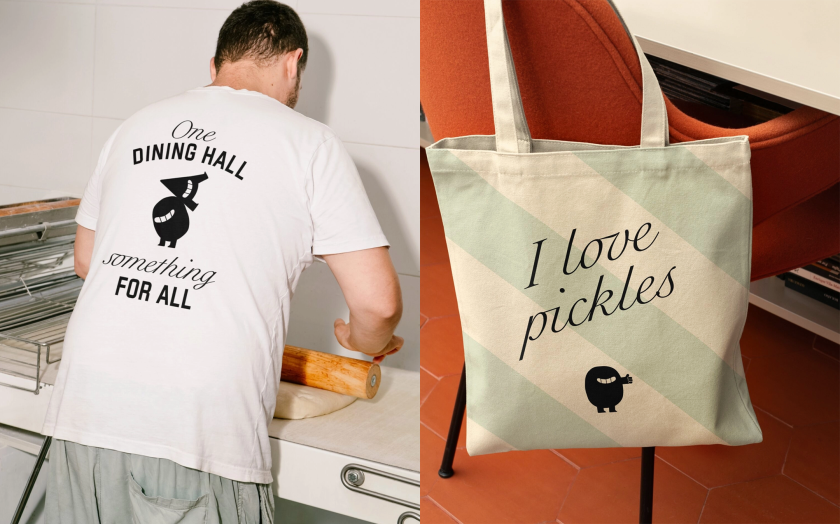
The strategy positions the canteen as more than a place to eat by positioning it as a campus stage for difference and togetherness. “One campus, thousands of students. One dining hall, something for everyone,” reads the positioning. This ethos informed everything, from the tone of voice to the operational tools, setting the brand apart in an often-overlooked space.
A collegiate system reimagined
Visually, One&All leans into familiar collegiate cues, like varsity fonts, bold stripes, and mascot characters, but applies them with a contemporary edge. The studio created two illustrated mascots, “One” and “All,” as the friendly faces of the brand.
Their personalities are designed to contrast, as One is a soft, circular vegan while All is an angular carnivore with a protein obsession. Together, they front merchandise, signage, digital touchpoints, and social media with light-hearted banter that mirrors the diversity of opinions found on any campus.
“The mascots do heavy lifting,” says Philip. “They bring warmth to what could otherwise feel institutional, and their constant disagreement becomes a kind of rallying point – a celebration of individuality, not a conflict.”
The colour palette is another deft move. After auditing existing university colours, the team settled on a rhubarb pink, a hue that no college had claimed but one that pairs well with nearly everything.
“The colour is surprisingly sociable,” says Philip. Supporting shades and textures help flex the identity to match local aesthetics while maintaining brand consistency.
Typography was also chosen to embody contrast: bold, varsity-inspired type sits alongside expressive script, mirroring Gen Z’s ability to embrace contradictions and nuance. Striped patterns add further texture, nodding to both deli counters and campus sports culture.

Flexing with purpose
While the visual system has character, the structure behind it is rigorously designed for scalability. One&All’s identity is built on a fixed-and-flex model, with core assets that remain consistent and adaptable frameworks for regional or site-specific variation.
This was essential in a sector where even colour choices can be politically loaded, particularly when rival colleges are involved.
From signage and uniforms to digital menus and in-app comms, everything has been designed to be flexible, usable, and rooted in campus life. Even the name is malleable: some campuses lead with One&All as the master brand, while others position it as a supporting motto (“by One&All, for One&All”) alongside local branding.

Systems thinking, brand-first execution
The deliverables for the project exceeded the guidelines. Without co-developed a full implementation system with Sodexo’s in-house teams, including operational playbooks, training resources, signage systems, and toolkits for food presentation, service tone, and interior touchpoints.
“We built what we call ‘operational translations’,” says Philip. “It wasn’t just about how the brand looks, but how it behaves — how it guides a service interaction, or how a dining space feels.”
Workshops and roadmaps helped teams at different campuses adopt the brand at their own pace, creating internal advocacy and ensuring a consistent experience across locations with vastly different resources.

Culture first, commerce follows
“With One&All, Without embraced difference and turned diversity into the very thing that brings us together,” says Diego Raso, VP of marketing & brand management at Sodexo. “It’s become a benchmark for how we build brands.”
Beyond functionality, the project marks a shift in how large-scale institutional brands approach their audiences. Gen Z is fluent in brand culture and increasingly sees food as an expression of identity, ethics and lifestyle. Branding in this space isn’t just decoration, as it exemplifies how purpose is made visible.
“There’s a growing expectation that where you eat should reflect your values,” says Philip. “And standing for something is clearly valuable – in one recent project, branding an unbranded outlet led to a 27% uplift in sustained sales.”

Bigger than branding
There’s no doubt that Without has proven that independent studios can take on billion-dollar systems and bring creativity to complexity, not by simplifying it away but by making room for nuance, character, and culture.
“We’re especially proud that this is a UK studio building a brand for American campuses,” Philip adds. “And doing it in a way that puts diversity at the centre, not the edges.”
In dining halls from New York to Nebraska, students might not think too hard about the strategy behind the signage or the colour of their menu. However, they will see characters who get their references, slogans that echo their conversations, and a brand that feels like it belongs, not just on campus but with them.