Fiasco marks 15 years in design with a feelings-first rebrand
Rooted in emotion and built for impact, Bristol-based agency Fiasco has rebranded to reflect who they are today and where they’re going next.
Fifteen years ago, Fiasco set out with no clients, no agency experience, and no clear roadmap. Instead, they had instinct, optimism, and a core set of values.
Over the past decade and a half, that foundation has evolved into a fiercely thoughtful and emotionally driven creative studio that’s now marking its anniversary with a striking new brand identity.
More than a fresh coat of paint, the rebrand is a full-circle moment for the agency. It captures not just the creative maturity Fiasco has developed over the years but the heartfelt, human-centred philosophy that’s defined its work all along.
From digital platforms to brand identities, the team has consistently prioritised emotional connection, visual storytelling, and purposeful experiences. Now, the studio’s own identity reflects that same approach.


“Every project we work on is strategically built around a core emotion to create a powerful and meaningful connection with the audience,” says Chris Tozer, partner and creative director. “We’ve turned this approach into a transparent offering: humanising brands by delivering that emotion at every touchpoint.”
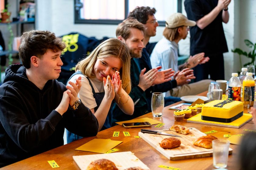
Led in-house over the course of a year, the rebrand involved all 16 team members in a process that was, by their own admission, often messy. But the chaos, says head of marketing and partnerships Nathalie Crease, was part of what made it meaningful: “It’s been a little like arguing with ourselves in the mirror, but it’s also helped us reconnect with what we love about Fiasco. It’s not just a design exercise; it’s a self-reflective one.”
This collaborative, introspective approach has resulted in a brand identity that balances creative tension: one part clarity and craft, one part spontaneity and joy. Design director and partner Julia Darze explains: “The new visual identity is built on a creative tension: the balance between the maturity and expertise we’ve developed over 15 years and the playful, spirited personality that defines us.”
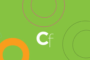
To express that, the team paired functional and expressive typefaces, built a monochrome base palette accented by celebratory colour, and embedded micro-moments of movement across the brand. Custom glyphs subtly disrupt the logo, interactive elements respond with joyful unpredictability, and typography reveals itself with rhythmic transitions. Its motion design is not just an embellishment but an extension of brand values: magnetic, human, and full of feeling.


Fiasco calls this approach “big moments, little feelings”, distilling complex narratives into singular emotional anchors. Whether it’s awe, joy, connection, or something else entirely, each project centres on how it should make people feel. That emotional precision then informs the visuals, interaction design, copy, and everything in between.
The rebrand also marks a new chapter of outward-facing generosity. Alongside its refreshed identity, Fiasco is launching a series of initiatives designed to share what it’s learned. These include open studio days, portfolio reviews, mentorship schemes, and an FAQ hub of insights and resources, all part of a long-held belief in nurturing the creative community.
“We truly believe in the power of the creative community, now more than ever, to bring light and optimism to the world,” Nathalie says. “The UK design industry is among the best globally, and as a part of that, we feel a responsibility to nurture that legacy.”


As a certified B Corp, Fiasco’s values also extend beyond the studio. From championing ethical clients to embedding care into its processes, the studio has created a framework where creativity is fuelled by connection and impact. That’s reflected in its team culture, too, with an emphasis on trust, collaboration, and emotional intelligence.
The rebrand is full of subtle cues that reflect this philosophy. Motion principles are based on magnetism – the force that brings people together. Typography balances structure with expressive detail. Even how a button animates on hover is designed to evoke a feeling.
Fiasco’s approach to brand building is meticulous but never cold. Instead, the new identity shows how precision and warmth can coexist. It’s an open invitation for clients, collaborators, and audiences to feel something and remember it.
That emotional resonance shows up in the work, too. Whether designing an app for a volunteer platform built around joy or shaping the identity of an electric aviation company through awe, the team always starts with feeling. The rebrand simply mirrors that methodology.


Looking ahead, Fiasco isn’t trying to predict the next trend or jump on the latest aesthetic. Instead, the studio is grounded in what it does best: crafting brand and digital experiences that connect on a human level. The new brand is a milestone, yes, but it’s also a foundation for what’s next.
“We hope our work moves people – that it sparks something, whether that’s a shift in thinking, a change in behaviour, or simply a feeling,” Nathalie adds. “That’s why we do what we do.”
The new Fiasco identity might be clean, confident and contemporary, but its most powerful element is the one it’s always had: care. Care for design, care for people and care for the emotions that live at the heart of every experience. If one thing is clear, it’s that, for Fiasco, design that works is design that feels.