FORM rebrands London’s Air Ambulance charity

As London’s Air Ambulance Charity looks to the future, FORM Brands Studio delivers a bold new visual and verbal identity that blends urgency and optimism.
London’s Air Ambulance Charity has revealed a bold new identity by FORM Brands Studio, designed to help the organisation deepen its connection with the public and boost vital fundraising efforts. Rooted in the idea of ‘Propelling Promise’, the rebrand strikes a balance between the high-intensity nature of emergency response and the warmth and hope that define the charity’s mission.
The rebrand comes at a pivotal moment for the organisation. With a new strategic direction and rising demand for its life-saving services, the charity needed a brand that could galvanise support across the capital while staying true to its 36-year legacy. As Jayne Clarke, director of fundraising & marketing, says: “The £17 million a year it takes to deliver our service can only come with the support of the city we serve.”
Working in close collaboration with the charity, FORM developed a new wordmark, colour palette, type system, icons, motion assets, copywriting, photography and fundraising materials. At the heart of the system is a gradient inspired by the motion of helicopter blades, nodding to the organisation’s operational core and a metaphor for constant action.


“Propelling Promise really took flight,” says Beth Andlaw, FORM’s co-founder and strategy director. “Teams across the organisation felt aligned to the sentiment of being a brand about action – a driving force, as well as compassion and hope.”
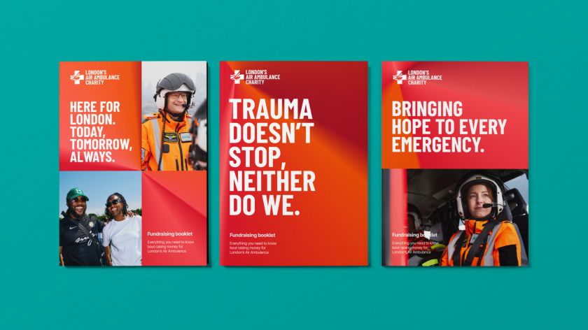
The visual system blends red – a long-standing part of the charity’s identity – with a new vivid orange, taken from the flight suits worn by medics at the scene. The gradient that fuses the two creates a striking and versatile signature that speaks to urgency, momentum, and life-saving care.
Alongside the visual refresh, FORM introduced a new wordmark inspired by the lettering on the helicopter tail. With subtle cues to flight and motion, it captures both function and spirit. Typography plays a key role throughout the system, with London borough names used in radiating patterns that reinforce the charity’s connection to the communities it serves.


“‘Propelling Promise’ became the platform that drove the entire verbal identity,” explains Alex Andlaw, FORM’s co-founder and creative director. “We were inspired by the intensity of the clinical work, the calm composure of the crews, and the deep bond between the charity and the people of London.”
The team extended that energy into a full creative writing system, ensuring every headline, call to action and fundraising message carried the brand’s dual spirit of determination and hope. Lines like “Trauma doesn’t stop. Neither do we” and “Here for London. Today, tomorrow, always” anchor the tone of voice, characterised as resolute but reassuring.


To make the brand tangible in new ways, FORM also designed a series of collectable badges inspired by the embroidered patches worn by the charity’s pilots and doctors. Serving as both brand memorabilia and fundraising tools, the badges give supporters a direct link to the frontline and deepen emotional engagement.
Photography by James Pearson-Howes adds another layer to the story, capturing real people and places across the capital to show the everyday relevance of the charity’s work. The tone is authentic and grounded, reinforcing the brand’s connection to lived experiences.
Crucially, accessibility was a guiding principle throughout the design process. The colour palette meets AA standards, and the typographic system was built to be legible and inclusive across all applications.


“We had an exciting opportunity to move our brand forward,” says Jayne. “The refreshed strategy leans on our bold history but still looks to the future – giving us a new identity and tone of voice that will help us achieve our ambitious goals.”
Alex Andlaw, founder of FORM, adds: “The new identity mixes the spirit of the original with the forward-looking nature of where the charity is headed. It brings everything together.”
From helicopters and hospitals to high streets and borough billboards, the new brand positions London’s Air Ambulance Charity as a vital presence across the city and as a service that doesn’t just fly into action but stays rooted in the lives it saves.