Gardiner Richardson gives well-being brand Life Factory a confident, human identity

With a mission to shift workplace health from tick-box to top priority, Life Factory’s new brand now leads with optimism, clarity and care.
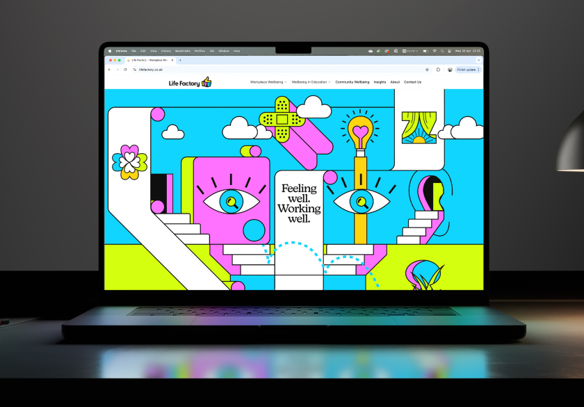
Workplace well-being brand Life Factory has unveiled a new visual identity by Gardiner Richardson, centred around a bold, upbeat ‘thumbs up’ symbol designed to cut through the noise of the crowded health and well-being space.
The rebrand aims to reposition Life Factory as a confident, compassionate alternative to the tech-heavy aesthetic dominating the sector, putting humanity back at the heart of workplace health.
In a sector brimming with abstract logos and algorithmic jargon, Life Factory sought to stand out. As a provider of well-being support for employees and employers alike, the brand wasn’t just offering services – it was championing a more proactive, people-first culture.
That mindset underpins every aspect of the new identity, which was developed in close collaboration with the Newcastle-based studio.

The studio’s brief was to give Life Factory a distinctive voice and visual identity in an increasingly crowded space. “The challenge was to stand out while staying relevant and meaningful,” says Darren Richardson, creative director at Gardiner Richardson. “We needed to find a way of humanising the name.”
Their solution is both simple and striking, in the form of a bold, stylised thumbs up, which anchors the identity and encapsulates the brand’s upbeat, proactive ethos. Embedded within the shape is a subtle nod to the word ‘life’, giving the logo a layered meaning that resonates across audiences and channels.
“The ‘thumbs up’ icon instinctively embodied Life Factory’s attitude to helping people,” Darren explains. “It’s positive, empowering, and grounded in the self-care zeitgeist. Let’s give life the thumbs up.”

This confident, emotionally intelligent design move sets the tone for the wider identity. The visual system is clean, colourful and full of character. It’s a deliberate departure from the sterile, data-heavy cues often seen in the health and well-being space.
“Ironically, the well-being sector is increasingly loaded with tech, algorithms and associated symbology,” says Darren. “But it’s a space that’s fundamentally about people. So it made sense to make the brand inherently human in form.”
That idea extends to the illustration style, which is developed to support the brand’s service areas and tone of voice. Rooted in surreal, slightly playful imagery, the illustrations bring lightness and empathy to topics that can often carry stigma or discomfort.

“Some of the areas Life Factory supports are heavy with preconceptions,” Darren explains. “So we approached the illustration style as a way to free those subjects up. Taking a more empathetic, surreal direction allowed us to leave things open to interpretation while giving the brand a distinctive look and feel.”
Beyond the visuals, the brand strategy focused on defining a clear and relatable personality. Gardiner Richardson began by speaking directly with Life Factory’s target audience – HR teams, business owners and employees – to uncover the real challenges they face around well-being at work.
Those insights led to the idea of the “wingman”, which is a metaphorical partner who understands the delicate balance between employer and employee needs.
“The wingman takes care of people so they can take care of the business,” says Darren. “It’s an empathetic role. Supportive, trustworthy, quietly confident.”
That character informed the wider tone of voice and positioning. It also helped guide decisions around messaging and behaviour across key brand touchpoints, from pitch decks to employee communications.

The collaboration with Life Factory founder Nick was, according to Darren, a key part of the project’s success. “Nick’s desire to move workplace health away from the classic ‘head in hands’ stock photography really shaped the direction,” he says. “He was open, engaged and willing to be challenged on how far to push the design.”
With a new brand that feels accessible, optimistic and built for growth, Life Factory is now better equipped to stand out. “The universally recognisable icon tells a timeless story of human encouragement,” Darren adds. “That’s a powerful idea. It gives the brand longevity as workplace well-being continues to evolve.”
For Gardiner Richardson, the project provided an opportunity to demonstrate how strategic design can spark meaningful change. Not by overwhelming users with data or tech promises but by tapping into something far simpler – a moment of human connection, a small gesture of care, a well-earned thumbs up.