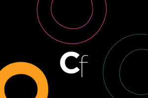
JKR and D&AD craft a magnetic new identity to celebrate creativity in motion
For this year’s D&AD Awards and Festival, JKR has reimagined the experience from the ground up, building a campaign that celebrates not only creative excellence but also the energy that draws people into the craft.
Few symbols hold the same weight in the creative industry as the D&AD Pencil. It’s sharp, iconic, instantly recognisable, and it’s been a beacon of excellence since 1962.
This year, that legacy has been reframed for the future in a new campaign and experience crafted by global brand agency Jones Knowles Ritchie (JKR).
Under the rallying cry ‘Drawn to Create’, the new identity positions D&AD not just as a judge of the industry’s best work but as a gravitational force that pulls people into the craft, into the community, and into creativity itself. The campaign is part of a broader push to unify D&AD’s brand ecosystem and future-proof its presence across digital and physical touchpoints.
“This isn’t just about the award any more. It’s about the joy of creating and sharing,” said Lisa Smith, global executive creative director at JKR. “D&AD has always celebrated the best in creativity, but now more than ever, it’s a place where people come together to connect, exchange ideas, and celebrate the creative journey as a community.”


At the centre of the campaign is the simple but potent phrase: Drawn to. It speaks to the magnetic pull that drives creative minds, not just toward a goal but toward a process, people, and purpose. It’s a platform that’s both expansive and intimate, allowing space for diverse stories and expressions under a unified message.
To ground the identity in something visually ownable, JKR partnered with Studio DRAMA to develop a custom typeface: Pencil Gothic. It’s a font rooted in the shape language of the D&AD Pencil itself – complete with hexagonal forms, 30-degree terminals, and chiselled details – though, beyond form, it’s also highly functional, built for international use and digital flexibility.
“We wanted a typeface that felt like it had always belonged to the brand,” said Chris Nott, creative director at Studio DRAMA. “Pencil Gothic gives the Pencil its voice.”
This voice extends across every touchpoint, from broadcast graphics and backdrops to social content and motion design. Titles animate into place with precision, and messaging strikes a careful balance between boldness and approachability. The overall feel is confident yet never closed off, inviting participation.
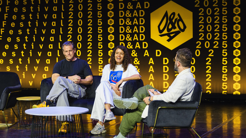
This year’s D&AD Festival took over London’s Southbank Centre, with the new identity brought to life through immersive graphics, spatial design, and interactive installations. From the outset, the goal was to create an environment that not only showcased work but also invited people to be part of the creative energy.
“We wanted to quite literally draw people into the event,” said Margarita Ianev, form and space director at JKR. “Design played a huge role, of course – but more than that, it was about building experiences that helped people connect with D&AD in a meaningful way and leave feeling inspired to be part of that community.”
Attendees could explore a two-day exhibition of winning work, customise their own garments at an interactive embroidery station, and even take home personalised prints from a robotic poster machine. A large-scale 3D Pencil sculpture became a living artwork as guests and performers added their own drawings to it over time.
Limited-edition merch and tactile, high-quality signage added further layers of interaction throughout the space. It was a campaign designed not just to celebrate creativity but to embody it.


The campaign, launched in April, aimed to build anticipation for the festival and encourage global participation, which clearly had the desired effect. This year’s awards saw a record number of entries and the most geographically diverse submission pool in the event’s history.
“We were delighted to work with JKR on the creative campaign and event branding,” said Donal Keenan, awards & festival director at D&AD. “As a multiple award-winning agency, they not only brought the creative idea but also campaign design expertise.
“We love the creative. It was engaging and uplifting throughout, bringing a sense of warmth and creative flair to the judging, festival, and ceremony events – all while perfectly complementing the D&AD brand.”
Crucially, the new identity isn’t a one-off. It’s been designed with longevity in mind, extending across digital platforms, speaker content, rankings, and the annual publication. It’s a year-round system that enables D&AD to maintain momentum, evolve, and continue to attract the creative industry.
It’s clear that JKR sought to deliver more than just a design update. It’s more of a brand behaviour that allows D&AD to express not just what it celebrates but how it operates.
It’s an approach that feels especially relevant today as creative communities seek spaces that are both aspirational and inclusive. It reminds us that while the Pencil may be the symbol of achievement, the journey is where the magic really lives.