The Guardian’s 2025 redesign is the upgrade readers deserve

Faced with an existential threat from AI, the leading liberal newspaper is fighting back with a major redesign focused on flexibility and mobile-first design.
When I first got into journalism in the 1990s, it was a licence to print money. Mainstream papers like The Sun sold two to four million printed copies a day, and even niche publications like The Guardian were pushing close to half a million. Most of the money went to the owners, but writers got fairly decent cash, too, and there was always work aplenty. They were good times.
Nowadays, much as I love the web, it’s devastated the print media I once adored. Making money online is a far greater challenge. The Guardian, shockingly, only survives through donations from readers and supporters. And its owners know it can’t rely on cash continuing to flood in, especially now that people can get news and information straight from AI chatbots without having to visit a specific news source.
So it’s great to hear that this week, The Guardian announced an overhaul of its app and website—the first major redesign of its digital platforms in a decade. Frankly, it’s long overdue, but thankfully, it seems to have genuinely improved things for readers.
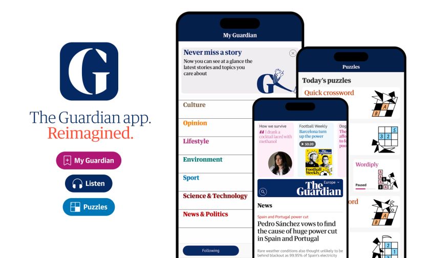
Truly mobile-first
Fundamentally, this redesign recognises that 75% of The Guardian’s audience comes through mobile devices. So rather than pay lip service to the notion of “mobile first”, they’ve fully embraced it. This isn’t just a responsive version of a desktop site; it’s a ground-up rethink of how news should be consumed on your phone. The new features include:
-
A less overwhelming homepage with curated highlights and improved onboarding for new users.
-
A redesigned and streamlined My Guardian tab that lets you follow topics and writers that matter to you.
-
Podcasts are now available in a dedicated tab, allowing easier discovery via the new in-app audio player.
-
The ability to listen to all articles through a new enhanced text-to-speech facility.
-
A new hub featuring the Guardian’s most popular puzzles, including Wordwheel, Wordiply and, for the first time in the app, Sudoku.
Visual diversity
At the same time, there’s a new approach to the presentation of articles that truly pushes things forward. The previous design was, let’s face it, rigid and uninspiring: essentially a glorified index of stories with predictable layouts. Now the redesign brings a level of art direction to digital news that shakes things up a little.
It’s not something you’ll necessarily notice immediately, though; it’s more about building greater flexibility into the system. Specifically,
-
flexible image handling, which breaks free from the tyranny of landscape-only photos
-
the option to publish without images when there’s nothing compelling to show (a brave choice but admirable choice)
-
vertical video integration that acknowledges how people actually consume video content
-
a masthead carousel that surfaces diverse content beyond just the day’s headlines
In short, you might not see much difference when you open the website or app today, but over time, the design variety, increased visual clarity, opportunities for personalisation, and easier navigation should make for a better overall experience. And that’s certainly more important, really, than winning a design award for a striking new aesthetic look.
By allowing sections to have their own visual identity through typography and layout variations, the publication has addressed the “everything looks the same” problem that plagues most news websites. To my mind, then, this redesign is a strong step towards the ultimate goal of online journalism: capturing the navigational clarity of print while embracing digital’s flexibility.
The Guardian’s readers have always been design-literate (sometimes painfully so). And this redesign respects their intelligence while making the experience less overwhelming. Instead of forcing readers through a prescribed journey, it allows them to “disaggregate” content the way they might physically separate newspaper sections.
Beyond cosmetic changes
This redesign’s importance can’t be overstated at a time when AI chatbots threaten to strip news of its context and attribution. By creating compelling, personalised experiences, The Guardian is fighting to retain and enhance direct relationships with its readers.
As creatives, we should applaud when a major publication invests in thoughtful UX that serves both business goals and user needs. In this redesign, The Guardian has raised the bar for digital news, showing that with the right approach, legacy media brands can create digital experiences that feel both contemporary and true to their identity.
The redesigned app is available now on iOS and Android.