Wedge reimagines Diana’s for a new generation of home cooks

Design studio Wedge has helped Canadian seafood supplier Diana’s evolve from a chef’s best-kept secret to a contemporary consumer brand, blending rich history with everyday joy in a spirited new identity.
Diana’s is no newcomer to the culinary world. For over 45 years, the family-run seafood supplier has been a trusted name in the kitchens of Canada’s top chefs and Michelin-starred restaurants. Now, with its sights set on a wider audience of home cooks, weekday diners, and families craving quality without fuss, the brand needed more than a packaging tweak. It needed a reintroduction.
Enter Wedge: the Montreal-based studio known for crafting emotionally resonant brand identities that balance beauty, strategy, and soul. Their latest collaboration sees Diana’s make a confident leap into the consumer market with a brand evolution that’s as nurturing as it is energetic.
“Looking at the category, which was rather traditional and stereotypical, there was a world of opportunity to inspire,” says Sarah Di Domenico, co-founder and creative director at Wedge. “We dived deep into the heart of the company to discover what made Diana’s so special.”


Before & After
At the heart of the brand story is its real-life matriarch, Diana herself. Rather than a generic heritage narrative or fictional mascot, the new identity centres on a powerful truth: this isn’t a brand with a founding father; it’s one built on the values, recipes, and personality of a founding mother. It’s a rare, resonant foundation that Wedge distilled into a guiding idea: The Mother of Seafood.
This central concept helped shape every aspect of the visual world. Sarah says: “We learned during our discovery workshop that it’s not just a name but a real person whose bright attitude and commitment to the best shaped the company.
“This energy drove the tone and visual identity – one that’s warm and nurturing, like the intense care only a mother can give.”
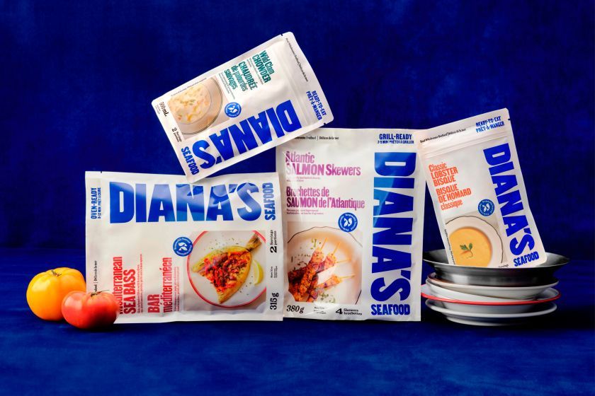
Rather than fall into the usual seafood tropes, like deep navy blues, stern serif typography, and anchors galore, Wedge sought to break the mould while retaining an authentic link to the category. Diana’s now has a bold, contemporary logo set in a vivid blue inspired by the hues of fishing harbour boats seen at a distance.
It’s a nod to maritime vernacular without veering into cliché. Look closely, and you’ll spot subtle “fins” worked into the terminals of the ‘S’ – a wink to the brand’s origins that keeps the mark playful and distinctive.

Typography, too, plays an integral role in maintaining this balance between tradition and freshness. The studio adopted Milano, a variable typeface designed by Alex Lescieux, spanning five widths from Compressed to Extended. The idea stemmed from a curious visual insight unearthed during what Sarah calls ‘Cultural Foraging’, defining it as an approach to design research that looks beyond the obvious.
“We stumbled upon typography on wooden crates and boats from the Mediterranean, which was a nice reminiscent detail to bring into the world of Diana’s,” she explains. “If you know, you know.”
This discovery informed a flexible typographic system where changing widths mirror the adaptability of old fisherman hand-lettering, injecting motion and charm into headlines and packaging.


Another key ingredient in the brand’s new visual identity is illustration, which adds a personality and craft to the identity in ways photography alone cannot. Wedge tapped California-based illustrator Bill Beholz to bring this to life. His playful, hands-on aesthetic, known for capturing food staples like tinned fish and San Marzano tomatoes, felt like a natural fit.
“Bill’s illustration complements and communicates the care and attention that goes into Diana’s products,” says Sarah. “It’s a nice addition to a company creating modern products that bring a touch that warms up the world.”
The packaging system is peppered with these expressive illustrations, including a friendly seabass on the back of one pouch. It’sThese subtle touches make the brand feel personal, real, and lovingly considered.


Photography was another crucial element in the rebrand, used not just to showcase products but to celebrate food’s emotional resonance. Wedge worked with fashion photographer Garrett Naccarato to give the meals a more elevated, editorial feel, far from the cold, sterile look that often plagues frozen or packaged seafood.
“In creating something new, the goal was to create something that also had a soul and sense of time,” says Sarah. “It’s one thing to ‘break the category codes’, but you still want people to feel a sense of relatability.”
That relatability comes through not just visually but also in the tone of voice. Wedge’s brand copy balances a sense of heritage with the everyday. It’s confident but not try-hard; warm but not overly familiar. It’s the kind of tone that invites you to trust what’s inside the packet while also sparking curiosity about how it got there.


Ultimately, Diana’s move from B2B to B2C wasn’t about abandoning its legacy; it was about opening it up. “It was natural for them to evolve in the B2C space with a vision to make great quality seafood accessible to the masses,” Sarah explains. The new identity helps bridge that gap: translating culinary credibility into mass appeal without losing what makes it special.
It’s a balancing act that Wedge has pulled off with care. Sarah describes it as being “like a meal”, adding, “It’s always in the contrast of the ingredients and how they are used.” The identity is full of duality, like photography and illustration, bold type and gentle tone, tradition and lightness. It all coexists to tell a new story rooted in a rich past but with plenty of room to grow.
With the new identity now live, the response has been enthusiastic, both within the seafood category and beyond. “We were more excited by the ambition our client Matthew Corbeth held than the category as it was,” says Sarah. “There was an opportunity to bring something different and elevate the tempo.”
She adds that Wedge’s mission is to “see the unseen” in every brand they touch, which is clearly evident in Diana’s. The team has surfaced something quietly revolutionary, creating a seafood brand that feels as personal as it does premium, where the legacy of a real woman shines through every detail.